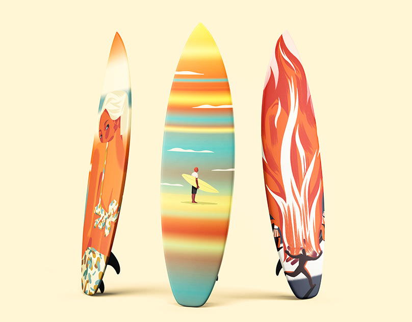
DESCRIPTION
Instagram may be used to make new friends and post humorous videos. Nevertheless, Instagram serves an additional function of alerting users to significant information and motivating them to support a certain cause. We were required to write three Instagram posts in my Type 2 class on any topic of our choosing, and we had to do it in a different style than we had before. I decided to write about three different kinds of pollution, each of which is the theme of my three posts. For my last assignment, I wanted to push myself with a bright style because I had never produced anything in the pop art genre. One further requirement for this assignment was to develop all the posts and up to five or ten slides for each using solely Photoshop.


Regular water pollution


Regular land pollution


Regular light pollution
I was able to edit and modify the images' style to fit my posts after locating them on Google or Adobe Stock. I utilized vivid colors and the well-known halftone for the background of my posts to make pop art immediately obvious to the audience. I enabled the use of three colors for each post. I had to use many masks to get the colors over some areas of the image.


Protanopia water pollution


Deuteranopia water pollution


Protanopia land pollution


Deuteranopia land pollution


Protanopia light pollution


Deuteranopia light pollution
The posts had to pass the Protanopia and Deuteranopia color blindness tests as the final requirement. Using three of the strongest colors in my postings made it simple to meet this requirement. Although I had to adjust the brightness in certain areas, the colors nevertheless managed to provide the disabled viewers with a comparable contrast because the colors have a significant contrast when seen with normal vision.
LEARNED FROM THIS MODULE
This subject taught me how to operate on a tiny scale and how readers read text on a page. With this project, I applied my understanding of small-scale design by leaving adequate white space around the words for easier reading. Moving the photographs to create a better hierarchy and deciding whether I wanted them to be viewed first was another application of small-scale knowledge. I was able to visualize the arrangement of my pieces once I discovered how people read content on pages. I was aware that the most crucial components must be positioned in the upper or lower corner.
LEARNED FROM OTHER MODULES
In previous modules, I learned the importance of hierarchy and legibility. Elements can be placed in a correct hierarchy by designating priority using color, scale, or placement. The ability to read is the definition of legibility. If the hierarchy or legality of your design is wrong, people won't be able to understand what you're trying to express and might not even stop to notice. Using this knowledge, I made sure the words were readable and the word hierarchy was not overtaken by the images. I still had to make sure the letters were in the largest font for the post's name or header because the pop art text overlapped them.